Client: Western Sydney University
Western Sydney University


Western Sydney University
Client
Western Sydney University
Date
2014 – 2018
Scope
Brand audit
Equity analysis
Brand architecture
Identity design
Brand guidelines
Wayfinding strategy
Signage design
Placemaking graphics
Documentation
Art direction
Collateral design
Project background
Despite being Australia’s third largest and fastest growing economy, the broader region of Western Sydney and the University has suffered from many negative stereotypes. Additionally, changes within the Australian tertiary education sector sees the need for Universities to become more competitive as government funding is decreased and the need to attract international students increases.
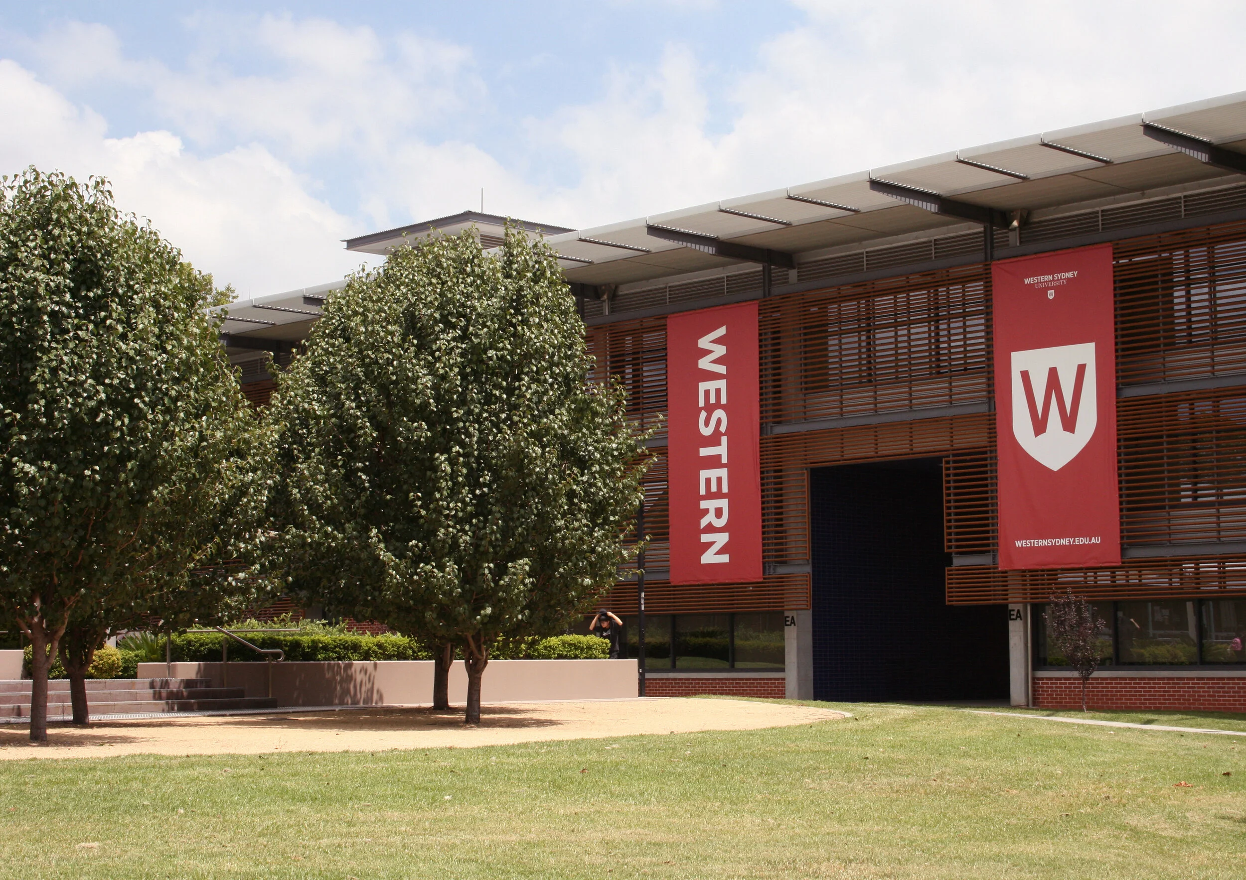
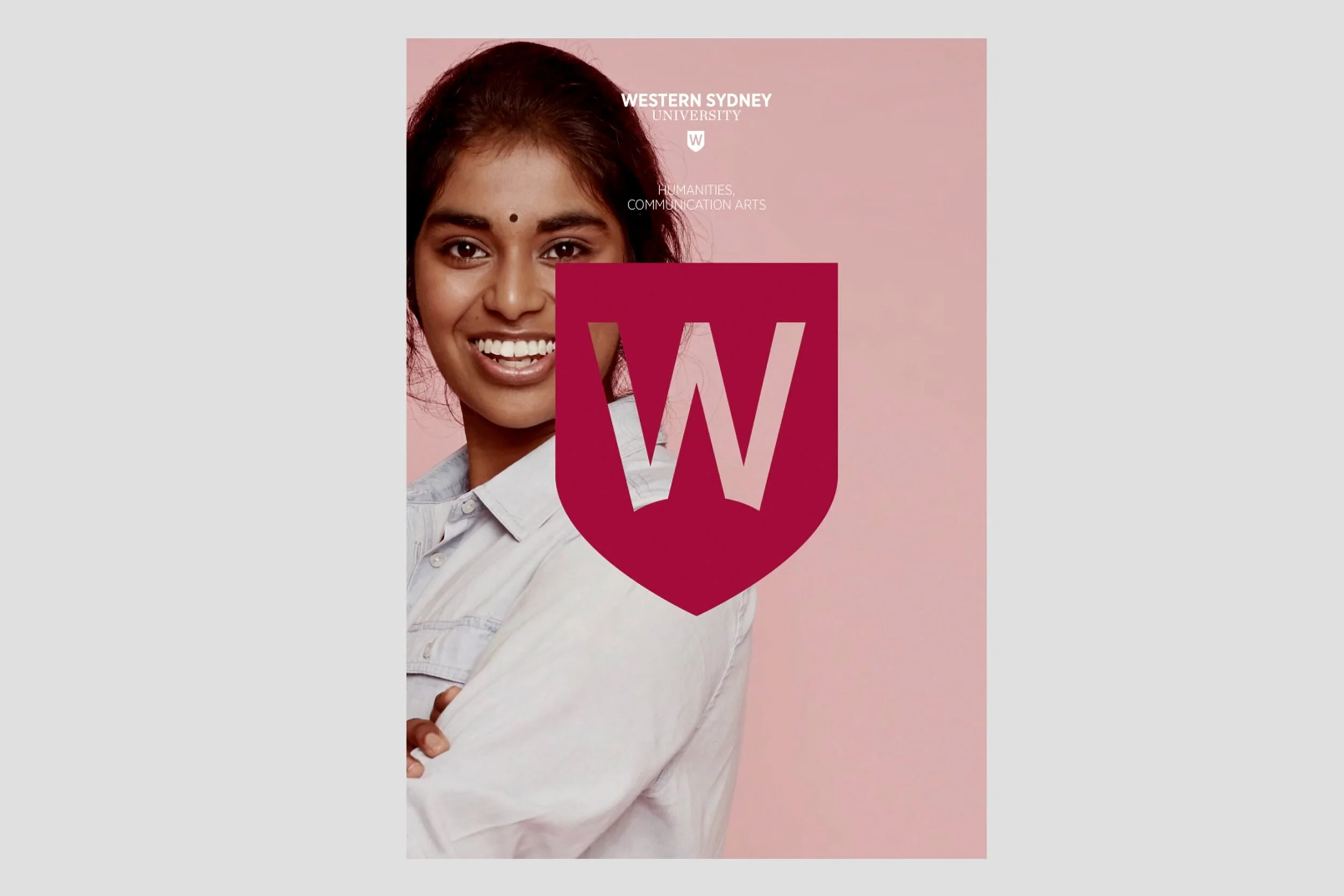
Formerly called ‘University of Western Sydney’, the subtle name change was symbolic of the importance of the region to the University. The shield provides a contemporary symbol of academia and is featured in an uncompromising, modern and strong manner in brand applications. The warm palette is inspired by the landscape and colours in the Western sun.
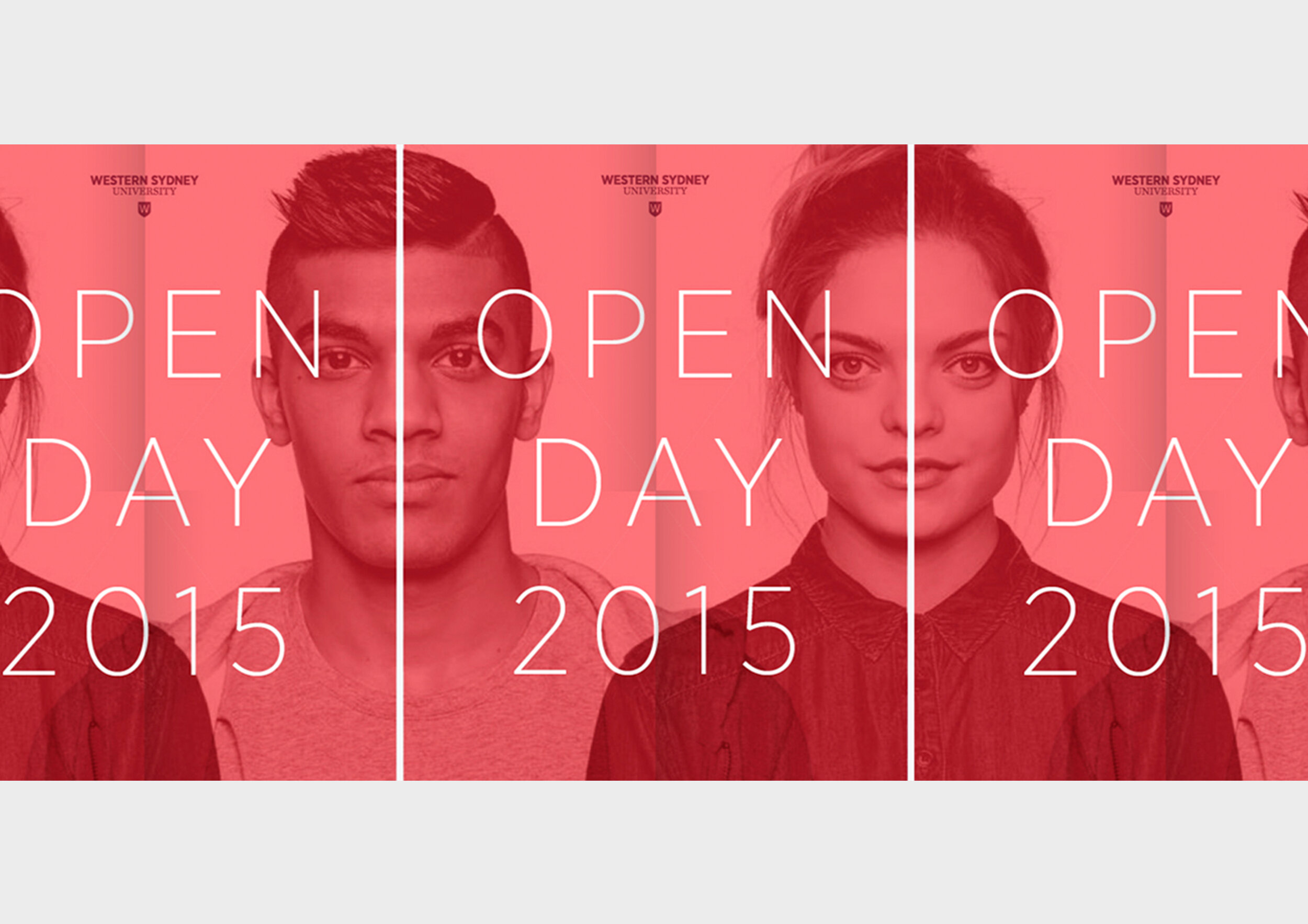
In the 6 months since launch (August 2015), there has been an increase in first preference ranking by school leavers and inbound international student enquiries were up 35% on the previous year. However the statistic we most love is that the University Store sold out of branded sweatshirts within the first week.